Springbrook Analytics
Create a New Report - Add Data
Adding Data to the Sample Report
This is the third of four topics that cover creating a new report from scratch. Please read the topics in order to ensure a clear understanding of the new report creation process.
-
Adding Data to the Sample Report - current topic
This topic covers adding data to the new report. Remember to save your progress frequently.
-
Every time you drag a field into the view or onto a shelf, you are asking a question about that data. The question will vary depending on where you drag various fields, the types of fields, and the order in which you drag fields into the view.
-
For every question you ask, the view changes to represent the answer visually - with marks (shapes, text, hierarchies, table structures, axes, color).
-
This example report allows you to select a fund (or group of funds) and a fiscal year (or group of fiscal years) and generate a report that includes the GL account number, journal entry number, journal entry date, period, year, system, description, task code, vendor name, debit amount, and credit amount.
-
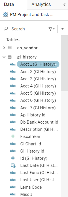
In the worksheet, the columns from your data source are shown as fields on the left side in the Data pane. The Data pane contains a variety of different kinds of fields, organized by table.
-
The first step is to drag the data fields from the Data pane to the Rows field. Individual tables can be expanded to display the data fields within. You can also use the search field at the top of the Data pane to filter the displayed fields.
-
NOTE: Each time you drag a new data field to the Rows field, Tableau will query the database and populate the relevant data. Because this query/populate process can take some time, it may make sense to pause this process by clicking the Pause Auto Updates button
 until you have added a few related fields. In this case, it makes sense to pause auto updates while adding the Account 1, Account 2, Account 3, and Account 4 fields.
-
-
Each time you drag a data field from the Data pane to the Rows field, a small orange arrow will show you where the field will be dropped. This is a helpful indication when attempting to drop a data field between two fields that have already been added to the Rows field.
-
You can also double-click a data field in the Data pane to add it to the last position in the Rows field. That data field can then be dragged to the desired location.
-
If you added the wrong data field to the Rows field, you can drag it back into the Data pane or drop the correct data field directly on top of the one you would like to replace.
-
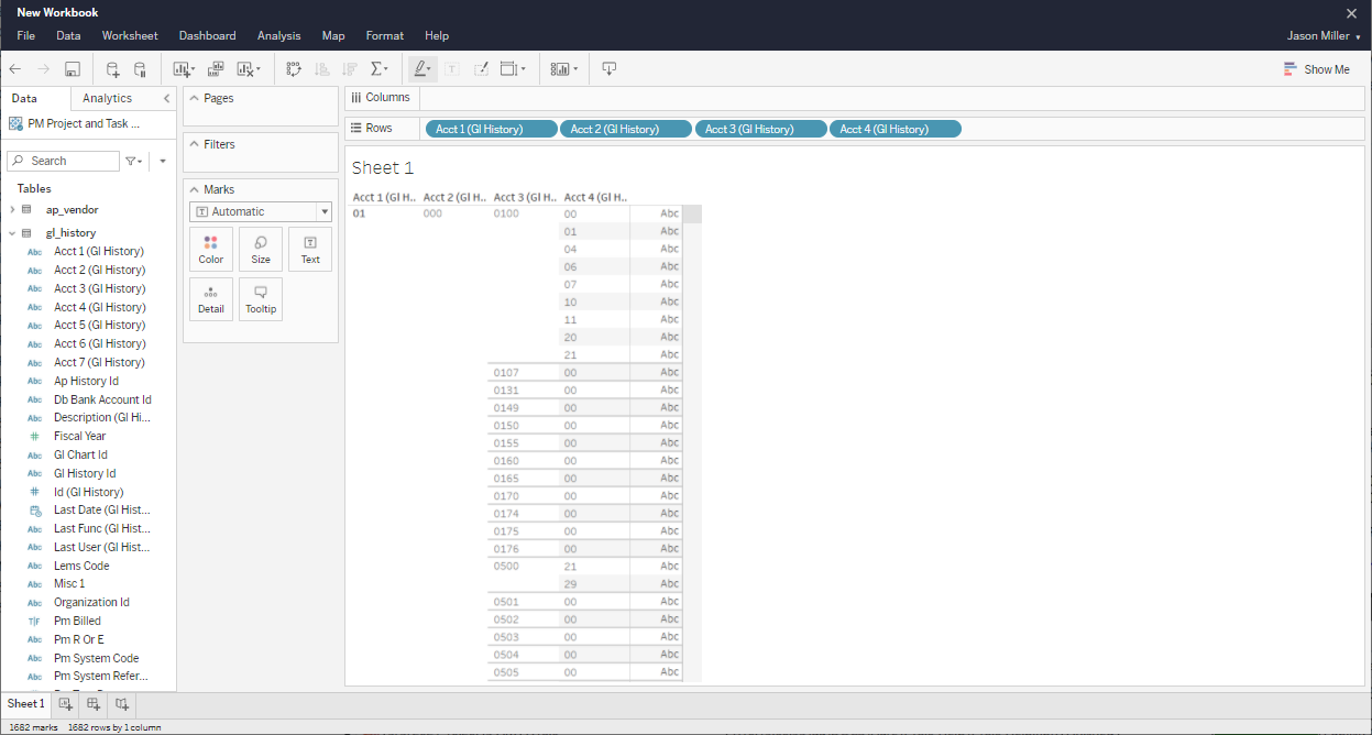
Once you have added the account fields and clicked the Resume Auto Updates button
 , your sample report should look like this:
-
The next data field you want to drag to the Rows field is the Journal Entry Number field (Journal Entry (GL Journal Entry) in the gl_journal_entry table).
-
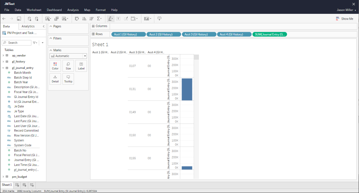
You'll notice this data field is displayed in green rather than the blue of the GL account fields. Measures are displayed in green while dimensions are displayed in blue. When you add the Journal Entry field to the report as a measure, the system will attempt to calculate that measure value as a bar graph, resulting in an odd report that looks like this:
-
This is not how we want the report to display the Journal Entry field. Because the Journal Entry field is a Measure field (signified by the # symbol displayed next to field in the Data pane), Tableau will attempt to calculate a SUM for that field. In this case, we want to include the Journal Entry field as a report Dimension rather than a Measure.
-
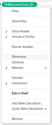
To make this change, click the drop-down on the Journal Entry field in the Rows field and select Dimension.
-
Use the same drop-down menu on the Journal Entry field to change the data from Continuous to Discrete.
-
Discrete fields draw headers (such as individual months in a bar graph) and continuous field draw axes (such as trend lines over time).
-
Discrete fields can be sorted and continuous fields cannot.
-
-
For a more detailed exploration of Dimensions vs. Measures and Continuous vs. Discrete, please see the Tableau help article Dimensions and Measures https://help.tableau.com/current/pro/desktop/en-us/datafields_typesandroles.htm.
-
The next data field you want to drag to the Rows field is the Journal Entry Date field (Je Date in the gl_journal_entry table).
-
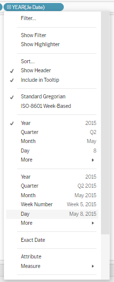
After adding this field to the Row field, Tableau will change it to YEAR (Je Date). As we would like to maintain the full date, use the drop-down to specify the type of date we want to use. In this case, we will select Day as it includes month, day, and year.
-
When changing it to Day, Tableau understands a day as Continuous data, so you'll need to go back into the drop-down menu and change it to Discrete.
-
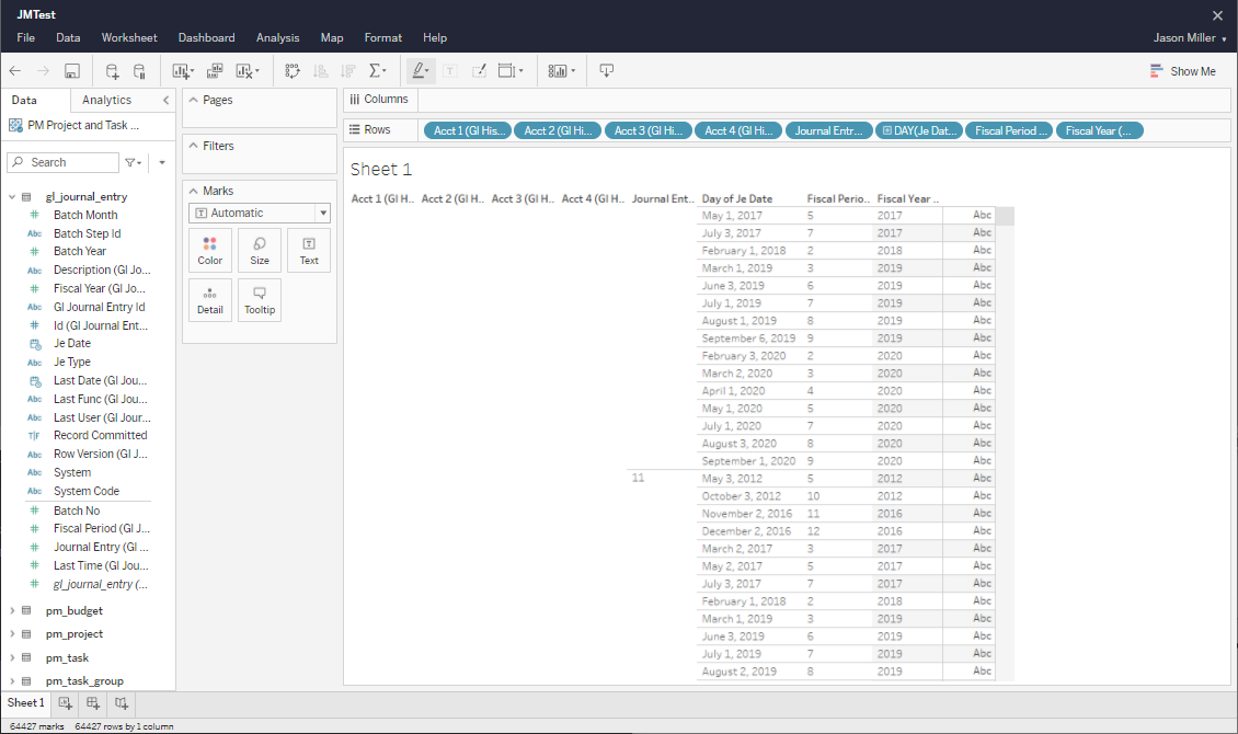
Repeat the process of adding the field and using the drop-down menu to change it to a Dimension and to change it to Discrete for both the Fiscal Period and Fiscal Year fields. After adding these fields, your Tableau view should look like this:
-
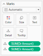
The Debit Amount and Credit Amount are the first two Measures we want to add to the report.
-
Instead of dragging those fields to the Rows field, you will drag the to the Marks field.
-
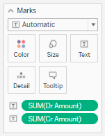
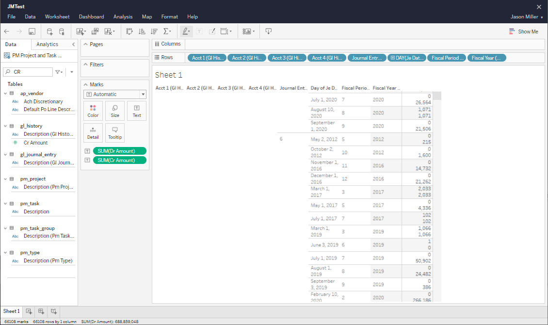
In order to get the debit and credit amounts to display as expected on the report, those DR Amount and CR Amount measure fields must be set as Text fields. To do this, simply drag each field into the Text section in the Marks field. You will see the icon next to the field change to Text.
-
The report should now look like this:
-
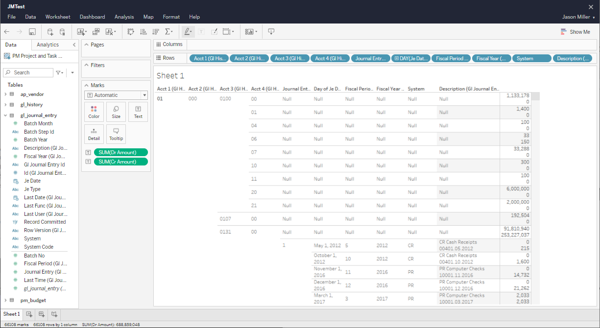
The next data fields you want to drag to the Rows field are the System and Description (GL Journal Entry) fields from the gl_journal_entry table.
-
These are standard dimension fields and after adding them the report should look like this:
-
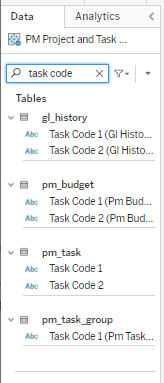
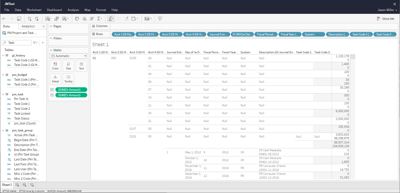
The next data fields you want to drag to the Rows field are the Task Code 1 (GL History) and Task Code 2 (GL History) fields from the gl_history table.
-
Rather than expanding each table to find the data field you are looking for, you can also use the search bar at the top of the Data pane.
-
After adding the Task Code 1 and Task Code 2 fields to the Row field, your report should look like this:
-
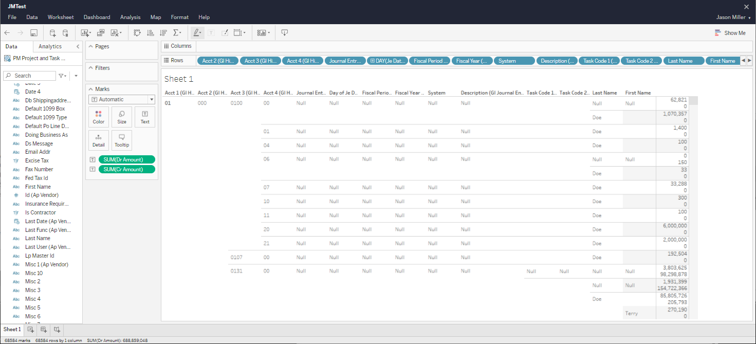
The last data fields you want to drag to the Rows field are the Last Name and First Name fields from the ap_vendor table.
-
After adding these two fields, your report should look like this:
-
While this does provide all the details needed to complete the report, the way it is displayed isn't as clear as it could be. The next topic will show you how to improve the look and readability of the report by combining fields and filtering out null values.
The next topic will cover Refining the Look of the Sample Report.